0

Help for a novice? I want to use the dark colour choice of Twenty Seventeen with Woocommerce. When I do so, the radio buttons on the "Checkout" page used to choose a payment method seem to be the wrong colour:

The selected radio button is black and the unselected radio button is white. On a dark background, the white button seems to be the selected one, which is quite confusing to the visitors. How can I change this?

I'm not an expert, and so am not even completely sure whether the problem is on the woocommerce or the Twenty Seventeen side, but I suspect it is with the dark theme of Twenty Seventeen, as the light theme works fine.

1 Answer 1

1

What do you mean on a dark background? Did you change the background color? My default twenty seventeen & woo install has a white background.

Anyway, you can make CSS adjustments by going into the admin > Appearance > Customize > Additional CSS.

You can inspect the CSS on the page by hitting f12. I would recommend inspecting the elements and adjusting the CSS colors values to what you like, then copy the changes into the admin customizer.

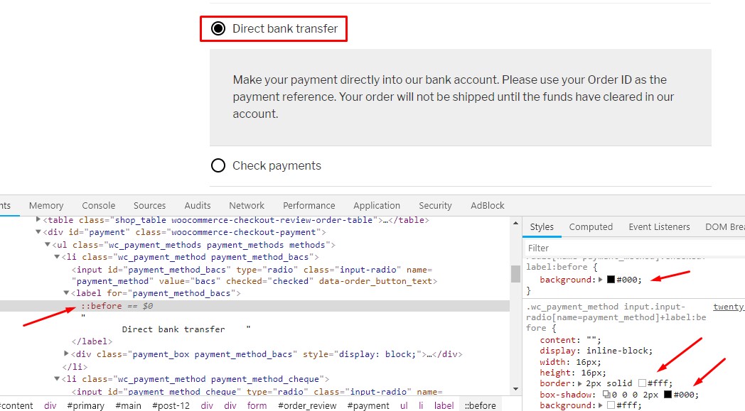
The below screenshot shows the elements you want to adjust. Use the inspector and click on the ::before inside the active label.

enter image description here

After you have the colors you want copy the changes into the customizer. For example, pasting the following CSS will switch the colors of the radios (black with white & white with black).

.wc_payment_method input.input-radio[name=payment_method]:checked+label:before {
    background: #fff;
}

.wc_payment_method input.input-radio[name=payment_method]+label:before {
    border: 2px solid #000;
    box-shadow: 0 0 0 2px #fff;
    background: #000;
}
2
  • Thank you for this answer RiddleMe. I will give this a go. By dark background, I meant the dark default option offered by Twenty Seventeen. The default is a light background (white), but one can customize to either the dark default option, or any number of colours chosen from a spectrum. I chose the dark option in the customizer, but didn't explicitly do anything else with colours. I'll get back to you once I've had a chance to try out what you suggest. Thanks!
    – PDS
    Commented Jan 4, 2019 at 5:18
  • Thank you RiddleMe, it worked! I actually chose a nice green for the "selected" radio button, which I think makes it very clear. The "unselected" radio button is black, like the background. AND, I learned how to see CSS using my tools in Firefox, where a SHIFT-Command C is required on my Mac. The F12 button on my Mac just changes the volume. :) Thanks so much.
    – PDS
    Commented Jan 4, 2019 at 7:02

Your Answer

By clicking “Post Your Answer”, you agree to our terms of service and acknowledge you have read our privacy policy.

Not the answer you're looking for? Browse other questions tagged or ask your own question.