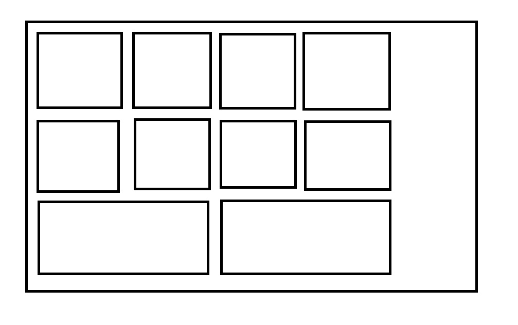
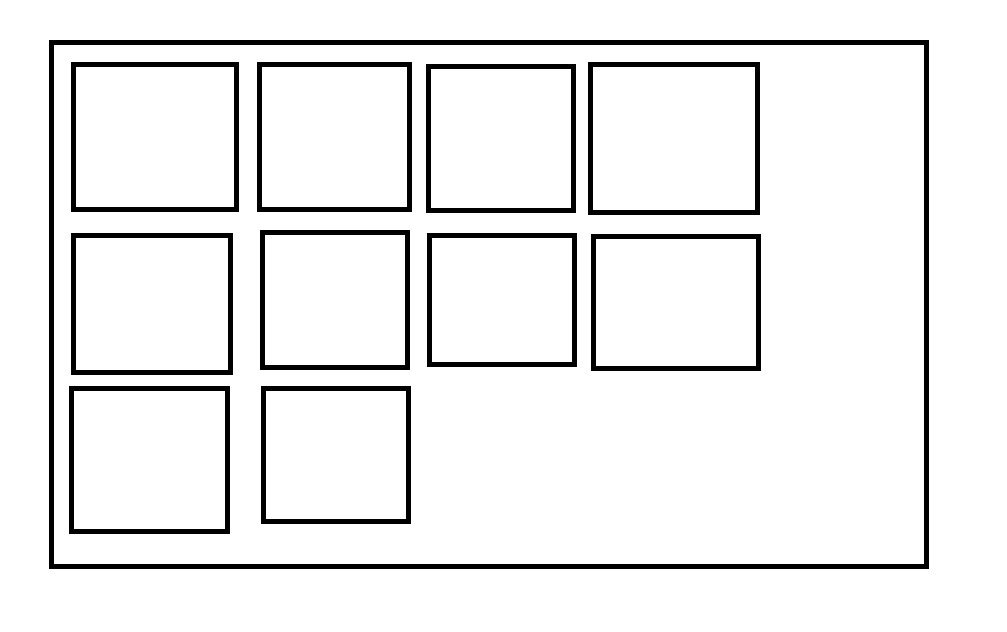
I am trying to implement a Gutenberg gallery with 10 images with a 4 column gallery. The first two rows coming fine with 4 column images each row. But the issue is that the last row, which has 2 images are adjusting itself to accommodate the full length of the gallery (as shown in the picture below). Is there any way to prevent that by writing some code? Please let me know. Thanks.
1 Answer
Gutenberg is applying a flex-grow: 1; to the items, which allow it to fill the space. You override this by pasting the following into your css.
.blocks-gallery-grid .blocks-gallery-image,
.blocks-gallery-grid .blocks-gallery-item,
.wp-block-gallery .blocks-gallery-image,
.wp-block-gallery .blocks-gallery-item {
   flex-grow: 0;
}
Ideally, you do this in your theme, but if you urgently need this up, or if you are unfamiliar with WordPress development, then you can add this to your customizer "Additional CSS" tab.
-
1Thank you very much @Faye It's working fine with the above solution.– MACMANCommented Aug 18, 2020 at 8:18


