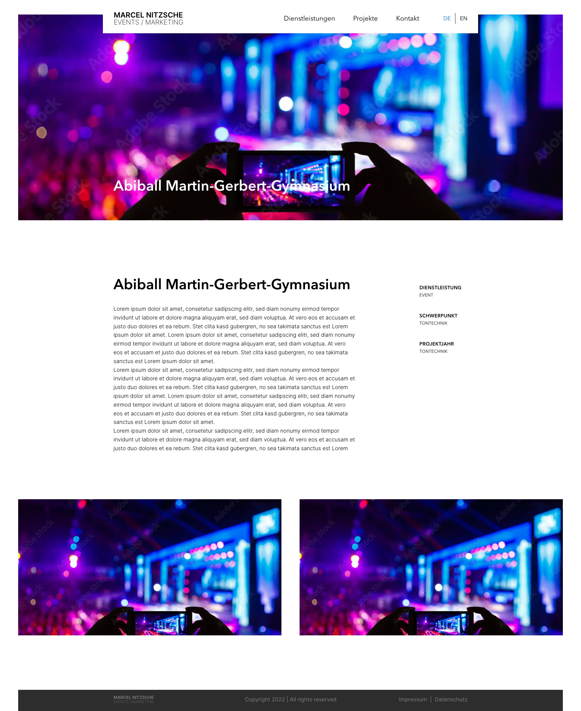
I am trying to achieve to following design:
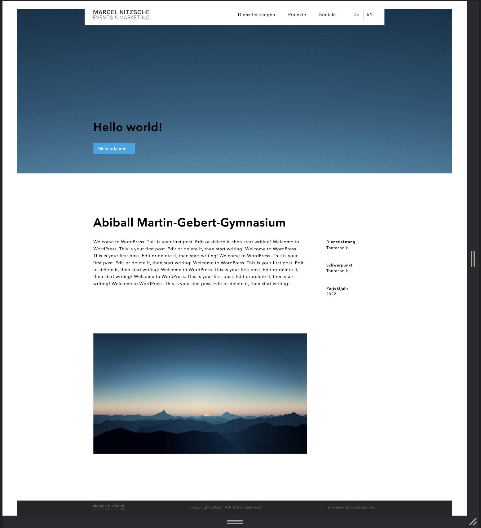
This is what I got so far:
I'd like to have the bottom images as in my design example.
This is, how my single.php looks like. I just can't find a solution that is responsive and works with my design :(
<?php get_header(); ?>


<div class="container px-4">
    <div class="flex flex-wrap gap-20">

        <article class="flex-auto w-[800px]">

        <?php if (have_posts()) :
        while (have_posts()) : the_post(); ?>
        <?php the_content(); ?>
        <?php endwhile; endif; ?>

        </article>

        <?php get_sidebar(); ?>

    </div>
</div>


<?php get_footer(); ?>
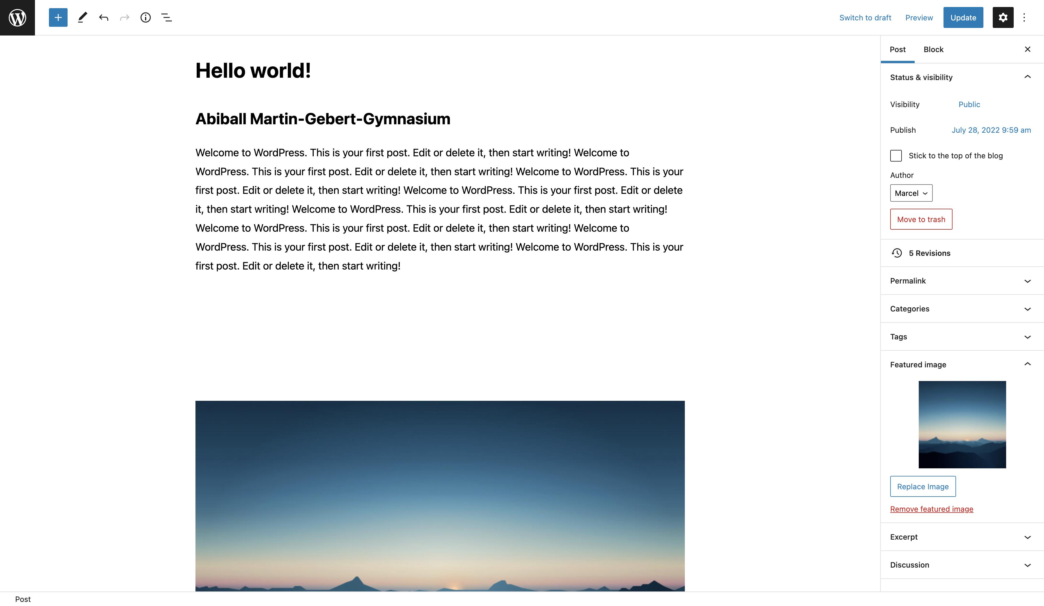
The images are placed within gutenberg and therefore part of the_content() which is displayed in a container. Is there a solution to display the images separatley for each post?
My workaround:
<script>
let header = document.querySelector('#header');
let width = header.offsetWidth;

let container = document.querySelectorAll('.container')[1];

let style = getComputedStyle(container);
let marginLeft = parseInt(style.marginLeft);
// marginLeft = marginLeft + 16

console.log(marginLeft);

const elements = Array.from(document.getElementsByClassName('wp-block-columns'));
console.log(elements);

elements.forEach(element => {
    element.style.width = width;
    element.style.marginLeft = '-' + (marginLeft + 16);
});


